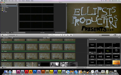
The clock moment was interesting to get right as we had to set up the camera and let it record for over half an hour so we could effectively have the clocks motion by doing this we had enough footage to reverse and speed up for times which not only created a brilliant effect made a lot of sense to show time going back, to show the audience what happened before to this woman in the build up to this moment. The second half has a strong saturated colour effect this was to create a contrast in the Locations but also shows her two personas, it’s there to represent her kinder side because although she has a femme fatale nature she used to be a lot kinder but what ever happened to her has changed this. The location is completely different this is why I included a lot of establishing moments to show the area and were character is.
The editing of the movement was sometimes a little tricky due to the fact that i struggled to make some things match, our other actor was not the greatest a taking directions and so this was making it difficult to get him to finish a section, but after some skill full editing I believe you can’t really tell. Some moments had to have the speed changes to make them flow better also. I created a scene that flows from footage that didn’t link, which I thought was well achieved. Also I liked the shot to the end where once again you don’t see the whole of the woman’s face I think this creates mystery like all femme fatale characters should have. This was a hard to edit because we had quite a bit of footage of this shot because we waited for a could gust of wind and the right positioning to get the perfect shot and when watching it back to footage sort of blends together so it becomes a case of just filtering down and filtering down. I think a lot of the editing comes down to the transitions I used some times the most simple transitions like a fade to black of a dissolve not only look more effective but more professional. This is why I stuck to using to better transitions.


No comments:
Post a Comment