


The filming went very well we the rough cut was still good but sometimes didn’t make that much sense; this is why we re-filmed some of the opening sequence because it makes the overall feel to the opening sequence so much more effective. Although the rough cut was good how we created the flash backs after getting the audience feedback we realised there were several thing that needed changing by doing a re-film meant we not only had done some more footage to play with but we now had a proper Rough cut with fed back that could be used for looking back an learning from. The second half of the opening sequence was ineffective it because it was the footage the audience had just seen but as a flash back. So we went to a completely different location but still with the same idea of a flash back but was shown in a better way instead of there being flash back in a hand held shot we film a watch edited it so it was in reverse so that the audience would know that the scene they had just watched was the present and the saturated scene after the watch was the past similar to the flash back idea. This was decided after some careful consideration after the first mistake we didn’t want to make the same mistake twice. This was why I think the second attempt a second half was more effective because it was firstly more panned and secondly less rushed. Overall I think now the filmed footage looks great but for future reference spend a little more time organising to make sure things don’t need to be re-filmed. The first half went well during the filming shot, I think this was due to it also being well planned we spent approximately 4-5 hours filming. So we had a lot of footage to play with. I do think though also that it went well because I and another group member spent a long time setting up the location and the shrine on our set to its full potential.
 The first thing we did before making our DVD menu we done some research, by looking at some of the films that inspired opening sequence, DVD menus. Before putting our final film on to a disc we had to create a DVD menu. To do this we picked footage from our film for it that was then played in the background of the DVD menu. We made a main menu that suited the genre and context of the opening sequence we created. We used the programme I DVD to create the menu which I felt went very well.
For the second half of our opening sequence we want to create some epic yet classic shots this was decided on as soon as we looked at the rough cut and realised how poor the second half of it really was, especially looking at the contrast between the first part, being footage that had spent a lot of time over and had a bit more of a theme and research used to created, made it look really good. But I feel that this contrast made the second half look even worse. So this was why I thought it might be better to have either more of a theme and more planned so to get it just right.
Here is our final design I made it through cutting out letters out of news print and then by adding in each letter separately I achieved a kind of type writer effect. I had to be so very careful so not to knock it as then I would have to start the process all over again. Once we uploaded the footage though I still had to spend time adjusting it to make it a lot faster. So we would waste too much time on it. Above is a still image of the final out come.

This was even animated using adobe flash but the group still wasn’t satisfied with this as its final outcome for our production company so we’re thought are plan of action and come up with something completely different.


I wanted to use a lot of key concepts for the plot using several conventions from the genres and sub genres of my opening sequence; this included using one tradition key conventions from a thriller genre. This is the main way we define genre if you can really define genre. Thrillers tend to have an obvious villain at the start but by the end of the film, the character the audience thinks is the antagonist at the start they realise is the protagonist by the end. The plot I think was a key part of deciding what to do with the opening sequence and make sure it would make sense by the end of the film if it was really made. I really like the plot it has a post modern idea of there being a nihilism character of the stalker, this idea give a character no limits, someone that believes in nothing, has nothing to lose. This means his ruining her life due to his infatuation is nothing but getting what he wants. This idea goes against the modernist view of a happy world, where good things happen to good people. I wanted to also challenge other genre theory’s by making a femme fatale character that also has a heart.
To make an opening sequence successful depends almost entirely on audience reaction. So the audience can make or break any production. So this is why this is a key area to target, so we can identify our audience for our own film. The social status that the audience comes from is important; I feel that the piece we are creating can be aimed at middle to lower class, C to D demographics. Due to it reality and drama which tend to attract more of this class also due to the genre of thriller and the twist with the media convention, a female stalker. To further the demographic I feel that the groups would also be Explorers group whom wish to view things in new a strange ways, who seek to escape; these are normally young people that are students. Either that or the minority of reformer audiences, who wish to make there own independent judgement, that have little majority. The reason for this is our productions is a small and independent and would not get viewing from majority consumer groups, our plot has locations that are small and would not appeal to the mainstreamers.
When our group started thinking about making our opening sequence, our first initial decision was going to be on the genre. We immediately wanted to do thriller, because of the options it gives us. It was thinking of a sub genre. This was why the plot was the decided on before we chose the sub genre. After looking at films such as fatal attraction and basic instinct, which was what inspired our femme fatal sub genre. Then from that we could decided the sub genre from my research our research, we found that our plot most related to a drama thriller, with a more of a slower pace than traditionally from this genre. So that our opening sequence can be more about the character then to much fast pace action, that starts off by showing none of the story. The genre was one of the most important thing to make a decision on this is why we spent a lot of time researching before making any final decisions.
I enjoyed making our DVD cover and promotional poster; they would do a lot for advertising, if we were to actually distribute our film. I used the same picture for both the poster and the DVD cover this make the film more recognisable to a potential buyer, due to the linking of the poster and the film its self. I stuck aiming for target audience and what they would be interested in, so this is what I concentrated on when creating both media products. The film is aimed at an older audience due to them being whom the film is intended for. I think this works well buy making it look dark and sinister, this would attract an older male orientated audience, because of the colour scheme creates the almost horror like affect and also having a beautiful woman on the front cover/poster grabs their attention. The story of a strong femme fatal woman would draw in a more female generated female audience and on both my promotional poster and the DVD cover I have used these conventions and I think they work rather well. Her I have also had a second idea for a poster; this one is aimed more at the target audience being women. Simple changes to the layout and font affect the appeal to different target audiences. The boarder pattern attracts more female attention to this poster make the film look a lot less dark then the other poster does. You can tell guess what it is about still, but this version appeals to more of a female audience rather than a male one.
After showing my posters to several people there were several changes that had to be made. Firstly the images used are slightly dull, the shadowy look was a good look but for several reasons this idea makes it look too much like a horror film, which this is not what the opening sequence is about. Conventions like this and others like the title font and the other text and words I used were not doing the film justice. For much reason this has made me make sure it is redesigned. Although from my initial audience research this is one form of advertising that most people are un-impressed by even put off of a film by an unattractive poster. This I feel is makes the poster more important so that it complements the trailer rather then set a bad vibe for the movie make sure it has the desired effect. So especially after the feedback I got I feel that my poster should be worked back into.

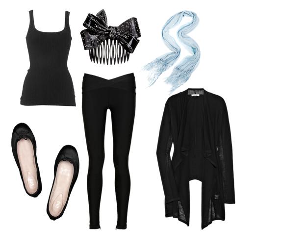
This is my chosen design because it represents the persona of the character and conveys the character we are trying to achieve. This simple design makes our fem fatal appear like anybody, they could blend in, not someone you would necessarily think of as someone out of there head. Also looks a little more thrown together then the other costumes. it still can look slightly gothic an sinister because the costume is all black, the all one colour keeps to the characters persona of being a bit perfect but can be messed up slightly for later in our opening sequence. This is the most boring of all the ideas I have found but it can be adapted easily and is something anybody would where we want our character to blend in as much as possible.

I liked this because it is slightly gothic and can be turned to look rather sinister, but I thought it would appear as an over analysed costume the jewellery is to gaudy and doesn’t fit the character, I was trying to portray. It has way to much gothic charisma in it and would make our femme fatal stick out in a crowd far to much and that is not the concept and persona of the character.

This is my least favourite idea, this costume was based on the idea that the character persona should be her wanting to be and look perfect, her being very organised and put together. But I thought the costume might not fit the character when actually being on screen. An make the audience confused because the costume might not fit what they are wearing.

I was trying to see what I thought a normal sane person might where so it seems a bit more of a shock for the audience to see someone that appears normal to be acting in such a way. It could be used to show the audience that just because someone looks sane it doesn’t mean they actually are anybody can loss all sense of reality I like this idea but it I think it looks a little to normal, i want the character to seem normal, with an edge, this costume doesn’t give much of an edge.

After the feedback we got from the rough cut we decided we needed more research on title, I did this using these two websites below that turned out vey useful particularly when getting the image due to the way in which each frame has been presented in this liner layout.
http://www.watchthetitles.com and http://www.artofthetitle.com
Seven

This is a good example of titles in an opening sequence, particular because of it being a thriller, as you cans see from the frames several of the conventions stick during each of the frame changes. But there are still several aspects that change including the positioning of the text, which it fits into the opening footage and sizing. I believe this shows that the film is none coherent, that it will be jumpy and interesting, but by keeping the fonts and colour the same we can see who they all link and fit wonderfully into this sequence.
To Kill a Mockingbird

I love the mono-chrome look, the titles are simple and don’t distract from the start of the film, in every frame almost nothing ever changes even down to the text positioning which show a organised piece, which automatically starts to tell the audience the stories.
Panic Room


